WHY DO YOU SIMULATE? MOST LIKELY, YOU WANT TO OBTAIN ANSWERS ABOUT LIFE, THE UNIVERSE AND EVERYTHING. AND WHAT DOES YOUR SIMULATION PRODUCE? NUMBERS. AND LOTS OF THEM. IN ORDER TO MAKE SENSE OF MORE THAN THREE NUMBERS AT ONCE, WE HAVE INVENTED THE GREAT ART OF CHARTS. IN THIS POST, LET’S EXPLORE HOW ANYLOGIC HAS TAKEN ON THAT ART AND HOW WE CAN GO BEYOND ITS LIMITED CAPABILITIES…
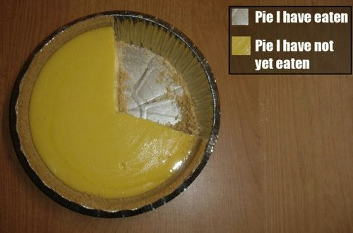
Everybody loves (pie) charts...
AnyLogic is great. I haven’t met anyone who seriously tried the software and said “aww, its rubbish”. However, there is one area that has always been a bit of an ugly step child: nobody talks about it, nobody plays with it much and when the topic comes up, people try to leave: AnyLogic charts.
They can be useful at times, but in my experience, they are too limited to “proper” use for these reasons:
- There is only a limited number of chart types (the most important ones, granted)
- Editing them is worth a PhD in its own right. Anyone who has tried to resize labels and chart areas will agree
- There is no good labelling. Essentially, you are left to your own devices using the “Text” object on top of charts
- The look is ok but most clients are used to Excel charts. It’s a subtle point but I feel people have less trust in charts looking different to what they are used to.
If you have played a little with AnyLogic, you might have noticed that this is not a simple drag’n’drop simulation tool.
You can put in code everywhere and it’s all a bit confusing at the start, right? If you are an experienced user, you know that every object in AnyLogic is programmable. So in order to draw your dream chart, use existing objects from the “Presentation” palette and program to change their appearance
during runtime.
Let’s say you want to plot a metric like the number of people passing through a door in real time. What you’d do is to change the height of a rectangle object depending on the number of people passing per minute.
This approach is very flexible as you can also change width, colour or object size. And you are not limited to rectangles. You can do the same with circles, lines or texts. You are not even limited to the “Presentation” library. Feel free to change the appearance of buttons, pictures or space markup. This is actually done in several AnyLogic example models. It’s not a hack, it’s a design feature :-)
Let’s spell this out more practically:
Grab your latest model and grab a metric you want to plot. Let it be some number that changes over time. In my sample model, I will vary the variable “myMetric” randomly over time as below:
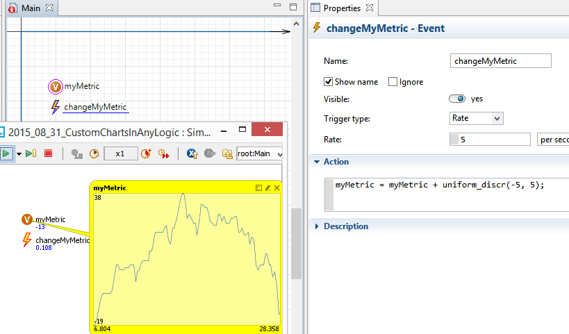
The event "changeMyMetric" changes the variable "myMetric" randomly.
Empty space, drag to resize
Now drag in the “Rectangle” object from the “Presentation” library. Explore its properties: you can make the “Height” dynamic and allow it to change during runtime (by clicking the little “=” sign next to it). In the text box, enter your metric like I did below:
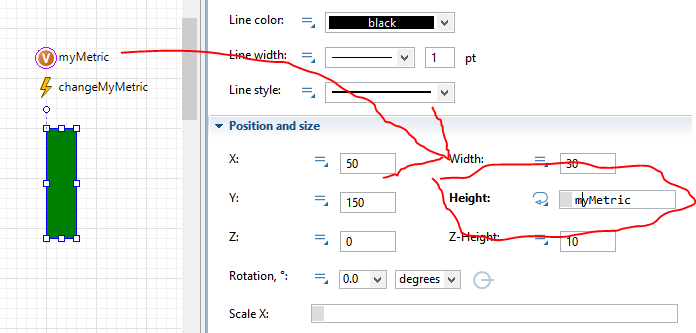
Make the green rectangle change its height when "myMetric" changes.
Empty space, drag to resize
Run your model and observe how the rectangle changes its height as your metric changes. You might need to adjust it by a factor to scale it nicely.
Now keep playing. Say you want to plot a number of values from a collection of data: you can replicate your rectangle and change its “X” position by its index. This way, you can plot neat bar charts very easily. Check this chart from one of my recent models: it actually plots several bars on top of each other and you can view/hide parts of the chart:
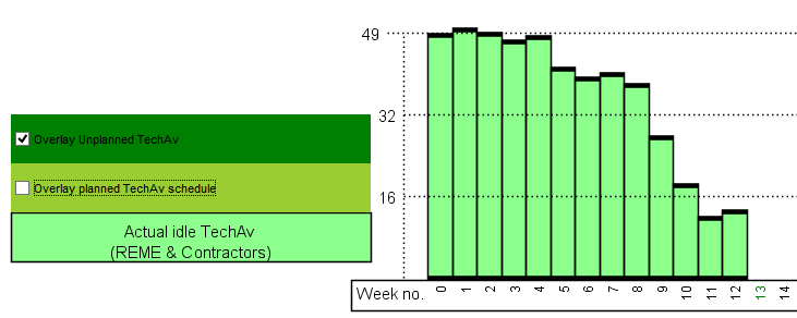
With this chart, you can overlay transparent information...
Empty space, drag to resize
So far, we have only touched basics. The logical next step would be to combine your model animation (you do have one, right?) with charts. There are some elegant AnyLogic example models doing this already. Launch the “Oil supply chain” model and let it run a little. You will notice that the refinery animation change over time like a pie chart:
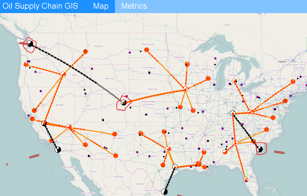
The black'n'wite dots are our refineries...
Empty space, drag to resize
Lets explore how this feat is achieved: In the “Refinery” class, there is a black arc object representing the refinery. In its properties, you will notice the same magic applied as you did above:
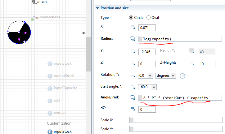
The pie chart changes with model metrics...
First, the black arc is on top of a white circle, leaving the impression of a pie chart. The radius changes with capacity so that the arc (and circle) actually grows when capacity is increased. Note the “log” function that avoids a linear increase in size. The “Angle” property changes how much of the pie becomes black as the ratio of stockOut over capacity. Again, model metrics are used to change how the pie changes.
The neat thing is to combine this chart into the model animation. Thereby, your client can feel at home without the need to mentally analyse separate charts. It is both convenient and elegant.
ANYLOGIC CHARTS ARE USEFUL IN SPECIFIC CIRCUMSTANCES. HOWEVER, YOU CAN EXPAND THE POWER OF MODEL ANALYSIS GREATLY BY CREATING YOUR OWN CHARTS. THERE ARE INFINITE POSSIBILITIES TO BE CREATIVE AND CREATE USEFUL CHARTS. THE KEY TO SUCCESS IS TO APPLY DYNAMIC OBJECT PROPERTIES TO GET OBJECTS TO CHANGE WHEN MODEL METRICS CHANGE.