Remember the last time you put your hands on a new Apple product: How did it make you feel? I recently bought an iPad for my daughter (disclaimer: I am no Apple fan at all!): I unpacked it and one friendly button waited for my gentle push. I was greeted and asked a simple question: “Which language do you want to use?”. It continued with more gentle questions until I arrived at the normal screen. Big friendly buttons, no clutter. “Don’t worry, I will take care of you” it seemed to whisper.

the iPad user interface is truly soothing
User interfaces are important. Not just for selling high-end products but also for simulation modellers. Not just to impress your client but for your own good. Hence, I decided to have a mini-series on good user-interface design in AnyLogic. Most principles are applicable for any simulation software, though.
I agree with you: it is not your intention to build “Apple” simulation models. Fair enough. Still, I’d argue that your excellent model without a good UI is like a Ferrari without wheels: very hard to drive. So why should you care:
- A good UI increases your client’s trust (or whoever uses the model). Granted, this is superficial of them, it is not an indicator of model quality and still: this is how we are wired. If you feel home in a model, you will trust it and you will want to spend time with the model.
- More quantitatively, you can increase your productivity enormously. Do you manually have to load data every time you run the model or do you have a big button saying “load data”? It makes a huge difference in the long run, even during model development. Have a good UI right from the start.
- A good UI actually reduces usage errors. Just like it would be really hard for a toddler to crash iPad software by playing with it randomly, it should be very hard for users (and yourself) to apply your model wrongly.
- You can scrap a lot of documentation through good UI. If it is intuitive and self-explanatory, there is no need to document large parts of your model formally. The model becomes the documentation.
Do yourself and others a favor: avoid this :-)
So what will this mini-series cover over the next few weeks? A quick overview:
- In this post, we will discuss a few general UI principles to remember, see below.
- Next week, we will see how a good experiment setup screen should guide users through their little adventure. How about this setup screen I designed for my PhD simulation tool?
- The week after, we will focus on the UI within your actual model. How about a task bar at the top of your model that can be used for navigation?
- Finally, let’s go into more detail and explore a nifty little AnyLogic feature often overlooked: view areas. These can help model navigation a lot while explaining many things without the need to read a boring document.
- Want another UI topic covered? Do let me know and I am happy to extend this mini-series
Ok, now that you are convinced that Apple design is not just for geeky App developers, what are some core UI principles relevant for simulation modellers? Let’s discuss four ideas:
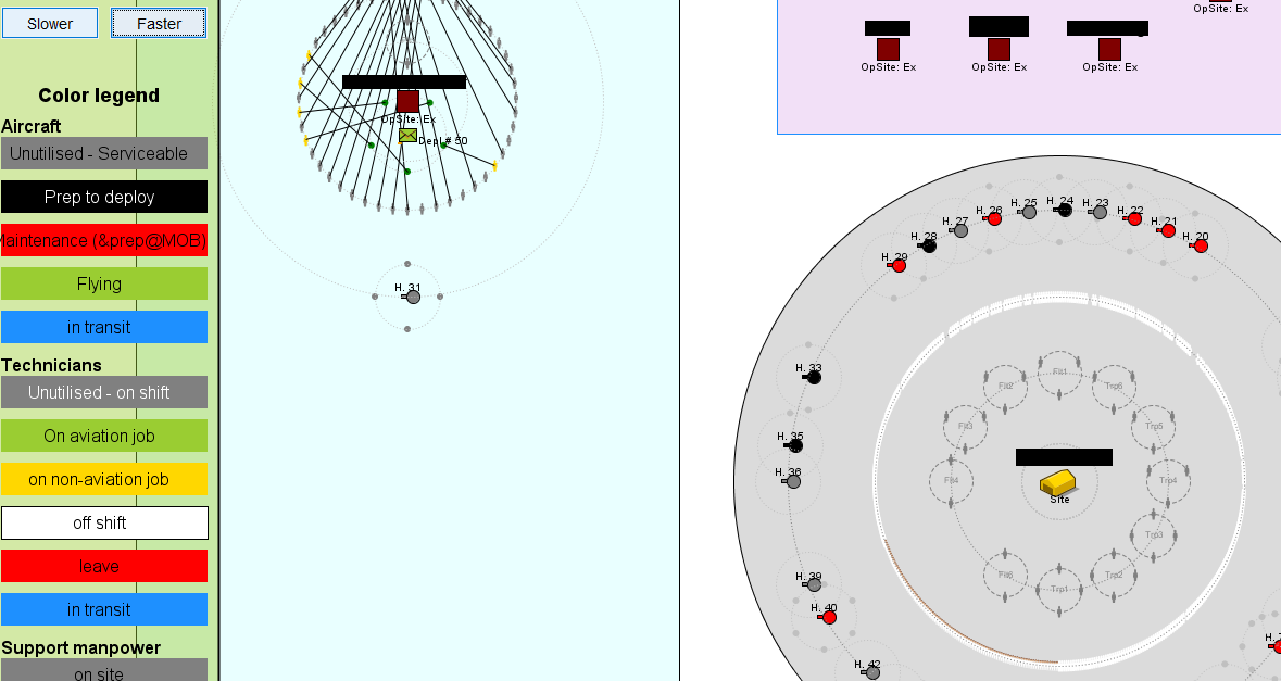
custom AnyLogic UI displaying lots of information visually
- Be intuitive: In my world, this is the most important principles of all. Design your UI to be self-explanatory. Do not flood the user with all the great possibilities of your model at once. Instead, take his hand (virtually, mind you) and provide options when they are relevant. You can display little help notes when necessary. Use elements that users are familiar with: buttons, sliders, edit boxes are all good choices: “oh, a button. I suppose I should click it”. Custom UI elements are trickier: you might have programmed a cool piece of new interactive functionality. However, the user doesn’t even notice it assuming it is just a weird picture.
- Be consistent: The entire UI experience should look similar, from starting the model to closing everything. Have mercy with your users: they just got used to navigating the model start screen. And suddenly, everything looks entirely different again. This one is particularly hard to follow because it does not concern yourself: you are very comfortable with different UI styles (or none) because you created the whole thing. A good philosophy to ensure good UI: imagine your grand-mother should use the model.
- Be easy: Making your UI easy is the hardest part. Where do you place buttons? How do you label items succinctly? How could your grand-mother use the software? As a general rule, the simpler your UI, the better. Sure, you can have hundreds of actions and options in your tool bar. But remember the old Microsoft Word menus? There were horribly complicated and uninviting. Being simple is a judgement call, though. Sometimes, your client wants lots of options. But following the other principles, you will still supply a useful UI.
- Be flexible: Avoid redesigning a model UI everytime. Create a template model file that will be the starting point for all future models. Build your model into the UI, not the UI onto your model!
Empty space, drag to resize
What was the best UI you ever experienced? How would it be applicable to a simulation model? Share your thoughts and send me ideas for other UI topics that should be part of this series.